
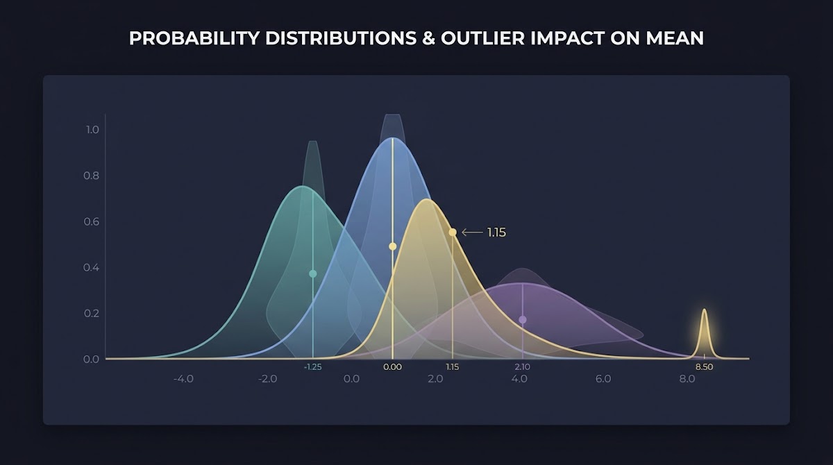
Why Raw Averages Can Be Misleading: definition and why it matters
The arithmetic mean, often called the average, adds values and divides by the count to produce a single summary number. That simple calculation is useful when a distribution is symmetric and values cluster around a central point, but it can be deceptive when a few extreme observations pull the summary toward a tail.
Avoid the raw arithmetic mean when data are skewed, contain extreme outliers, or when subgroup sizes vary and weighting is needed; run diagnostics to choose a robust alternative.
Think of the mean as the balance point of a scale and the median as the middle person in a line. When someone at the end of the line is extremely heavy or light, the balance point shifts much more than the middle position, which helps explain why raw averages can be misleading in skewed data.
What we mean by "raw averages"
By raw averages I mean unadjusted arithmetic means reported without contextual checks such as medians, percentiles, or notes on weighting. The term signals a single-number summary presented without diagnostics that reveal the distribution shape or the presence of outliers.

Simple examples of misleading averages
A common example is reporting a single average income figure for a population where a small number of very high earners lift the arithmetic mean above what a typical person earns. Official statisticians often avoid that pitfall by preferring medians when describing typical worker earnings, because medians are less affected by extreme values BLS weekly earnings release.
How the arithmetic mean responds to skew and outliers
The mean's sensitivity comes from its construction: every observation contributes an amount proportional to its deviation from the current average. A single large or small value changes the sum and therefore shifts the result, sometimes substantially when sample sizes are moderate or tails are heavy.
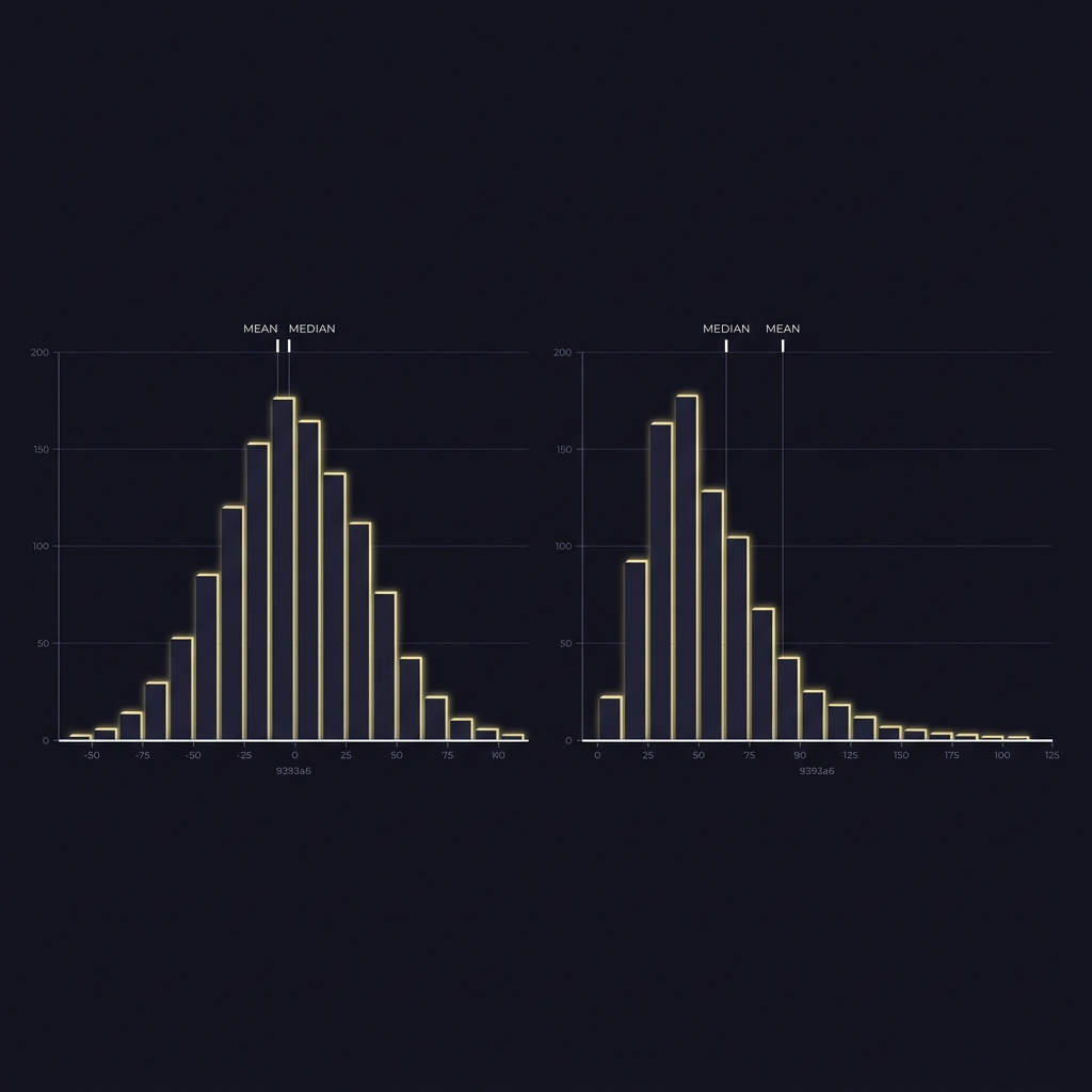
That influence is not a flaw in the arithmetic mean; it is a property. In symmetric, well-behaved distributions the mean summarizes central tendency efficiently and interacts predictably with variance. But when the data are skewed, the mean tends to lie further into the long tail than other central measures, which is when it can mislead readers about what is typical.
Sensitivity of the mean: variance and influence of tails
Statistically, an observation's contribution to the mean does not diminish with distance the way it does for medians. Robust alternatives were developed to limit tail influence and produce summaries that change less from extreme values, which makes them more stable for skewed data NIST e-Handbook on winsorized means.
When the mean is informative and when it is not
The mean is appropriate when the audience expects the arithmetic average, when distributions are roughly symmetric, or when subgroup weights justify averaging by value rather than by observation. If the goal is to reflect a typical member rather than aggregate magnitude, consider medians or other robust summaries instead.
Why Raw Averages Can Be Misleading in official statistics
Trusted institutions demonstrate practical ways to avoid reporting confusing raw averages. For example, the Bureau of Labor Statistics reports medians for weekly earnings to reduce distortion from top incomes and better represent typical wages BLS weekly earnings release.
Central banks use median or trimmed-mean inflation measures to dampen volatile price outliers and expose persistent trends that headline averages can obscure, a practice that shows how alternative summaries can improve policy-relevant interpretation Trimmed Mean PCE methodology.
Run the diagnostic checks and document your choices on the FundedPlays Challenges page
The diagnostic checks in the following sections are practical ways to decide whether an average is appropriate; run them on your dataset before you publish a single-number summary.
BLS use of medians for weekly earnings
The BLS choice to publish medians illustrates a simple principle: when a few high values would otherwise move an arithmetic mean away from what a typical worker experiences, the median presents a more representative central figure. This approach reduces the risk of overstating typical outcomes or policy effects.
Central banks and alternative inflation gauges
Measures such as the Cleveland Fed's median CPI and the Dallas Fed's trimmed-mean PCE intentionally remove or downweight volatile price movements so that policymakers and analysts see the underlying trend more clearly; the methodology behind these indicators shows the practical value of robust summaries Cleveland Fed Median CPI documentation.
Median and percentiles: common robust summaries
The median locates the midpoint of an ordered dataset and is unaffected by how extreme tail values are. Percentiles describe other positions in the distribution and let analysts highlight the experience of different parts of a population instead of relying on one aggregate.
Regulators often use percentiles to limit sensitivity to occasional extreme events. For example, air quality standards can be framed around a high percentile to prevent a few bad days from disproportionately determining compliance or public messaging EPA NAAQS table.
How the median and percentiles reduce outlier influence
Because the median depends only on rank, not magnitude, it remains stable when tail values change. Percentiles extend this idea by letting analysts choose which part of the distribution to emphasize, so a 90th or 98th percentile focuses attention on high-end outcomes without letting singular extreme days dominate the summary.
Regulatory examples: why the 98th percentile is used in air quality standards
Choosing the 98th percentile for a pollutant like PM2.5 over a multi-year window balances the need to protect public health from high-exposure days while avoiding overreaction to isolated events. That percentile-based framing is a policy choice designed to be robust to sporadic spikes EPA NAAQS table.
Why Raw Averages Can Be Misleading: trimmed and winsorized means
Trimmed and winsorized means are pragmatic compromises between the raw arithmetic mean and the median. A trimmed mean removes a chosen share of the smallest and largest observations before computing the mean, while a winsorized mean replaces extreme values with nearer values at the trimming thresholds.
These techniques deliberately limit tail influence to stabilize estimates when outliers or heavy tails exist. They are commonly recommended in applied settings where some sensitivity to magnitude should be retained but overall volatility from extremes must be reduced NIST winsorized mean guidance.

What trimmed and winsorized means do to tails
In practice, trimming might remove the top and bottom 5 percent of observations and compute the mean on the remainder, while winsorizing would cap values beyond the 5 percent thresholds to the threshold values. Both approaches reduce variance by shrinking or eliminating extreme deviations.
Tradeoffs: bias versus variance
The key tradeoff is that trimming or winsorizing introduces a small bias toward the center in exchange for typically large reductions in variance when outliers are present. That tradeoff is often acceptable when the goal is a stable, communicable summary rather than a fully unbiased estimator in every possible dataset.
Weighted means and subgroup weighting: when simple averages lie
An arithmetic mean that treats each observation equally can mislead when observations represent groups of different sizes. For example, averaging subgroup averages without weights can misrepresent the overall population if subgroup sizes vary.
The OECD emphasizes defensible weighting choices when summarizing income distributions so that reported averages reflect the population of interest rather than the average of subgroup summaries OECD income-distribution guidance.
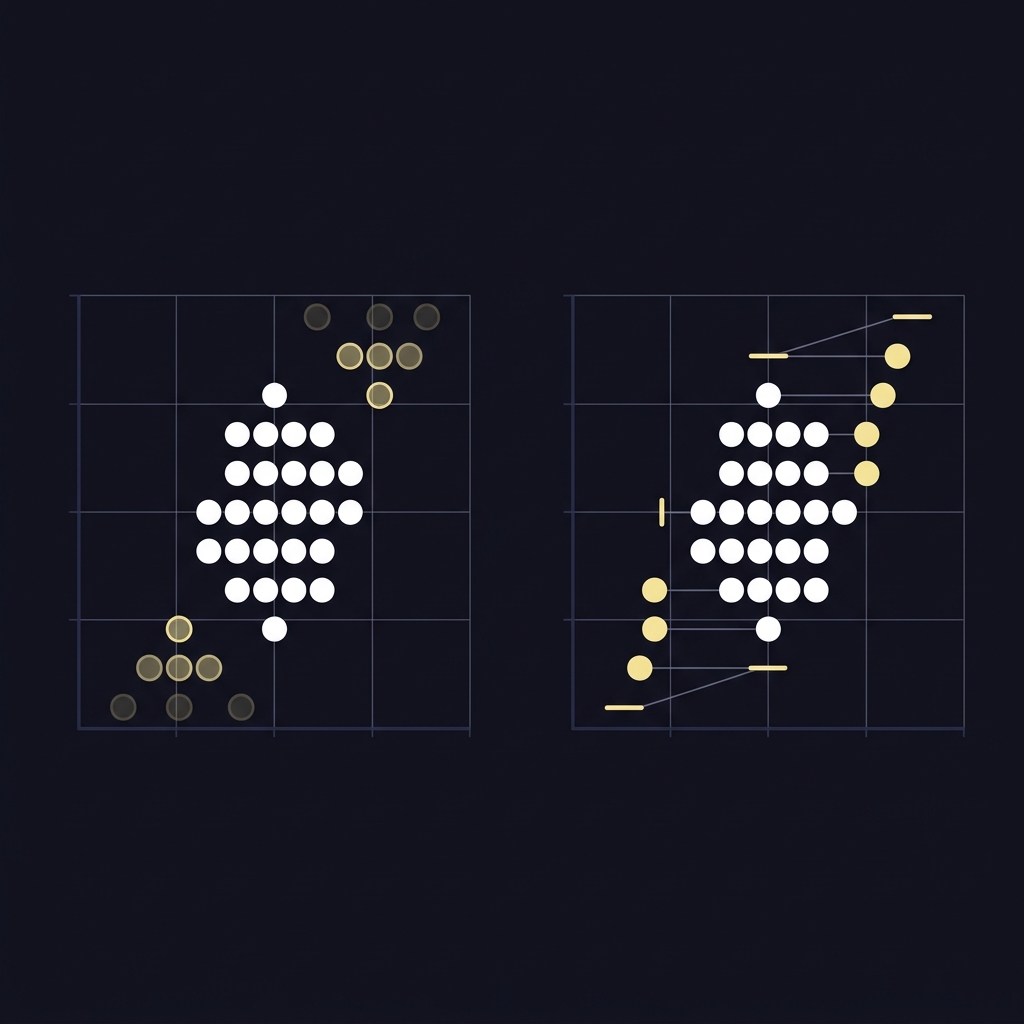
Why weighting matters when groups differ in size
If you report a mean from several regions or demographic cells, choose weights proportional to the subgroup population or economic magnitude you intend the average to represent. Unweighted summaries can produce misleading cross-group comparisons and flawed headline figures.
OECD guidance on income-distribution weighting
The OECD documentation outlines principles for selecting weights that align with the analytical goal, whether the focus is a per-person average, a household average, or another policy-relevant aggregate; transparent reporting of weights is essential for interpretation OECD income-distribution guidance.
Why Raw Averages Can Be Misleading: practical diagnostics before you report an average
Before publishing any single-number summary, run a few quick checks to reveal whether a raw average is appropriate. Start by comparing the mean and the median, then inspect percentile spread or the interquartile range to reveal skew and tail behavior.
Also check subgroup sizes and whether weighting is required. If the mean and median differ appreciably or the IQR is large relative to the mean, consider alternative summaries and sensitivity checks.
Quick checks data reporters should run
1. Compute mean and median and note their gap.
2. Inspect the 10th, 25th, 75th, and 90th percentiles and the interquartile range.
3. Identify extreme observations and consider whether they are data errors, exceptional but valid cases, or inherent features of the population.
4. Verify subgroup counts and decide whether weighted aggregation is needed.
5. Run trimmed and winsorized versions at multiple levels to test robustness.
Provide quick reproducible checks before publishing an average
Save scripts and seed values for reproducibility
When to show multiple summaries
If diagnostics indicate skew or influential outliers, present more than one summary: the mean for aggregate magnitude, the median for a typical case, and selected percentiles to describe distributional tails. That practice helps different audiences find the perspective most relevant to their decisions.
A decision framework: choosing mean, median, or robust alternative
Choose a summary based on distribution shape, audience expectations, and the analysis purpose. The framework below converts those considerations into a short sequence of checks and decisions.
Step 1: Is the distribution approximately symmetric and free of extreme values? If yes, the mean is acceptable. Step 2: If not, does the audience need an estimate of a typical member? Use the median. Step 3: If the audience needs a central magnitude but data have heavy tails, use trimmed or winsorized means and report sensitivity. Step 4: If aggregating groups of unequal size, use weighted means and disclose weights.
Step-by-step decision flow
Begin with exploratory plots or summary percentiles, answer the symmetry and outlier questions, and follow the steps above. Keep decisions simple and document each choice to preserve transparency for readers and reviewers.
Key questions to answer about purpose and audience
Ask whether readers expect an arithmetic total, whether they care most about a typical individual, and whether policy or operational decisions depend more on tails than the center. These answers guide the appropriate summary.
Common reporting mistakes and how to avoid them
Mistake 1: publishing a mean without context. Always show median and at least one percentile or the IQR alongside the mean when skew or outliers are possible.
Mistake 2: aggregating subgroup averages without correct weights. Verify and disclose weights to avoid misleading population-level summaries.
Mistake 3: trimming or winsorizing without documenting choices. Report the level of trimming and show sensitivity across reasonable levels so readers can judge robustness.
Mistake 1: reporting a mean without context
Correct by providing a companion median and a short note explaining how outliers affect the mean. This simple addition prevents readers from assuming the mean represents a typical case when it does not.
Mistake 2: ignoring weighting and subgroup sizes
When groups differ in size, calculate a weighted mean that reflects the intended population. If weights are unavailable, state the limitation clearly so readers understand the scope of the reported figure.
Mistake 3: over-trimming or hiding methods
Avoid excessive trimming intended to make numbers look cleaner. Instead, explain the rationale for the chosen trimming level and provide sensitivity results so the audience can see how conclusions depend on that choice.
Practical scenarios: earnings, inflation, air quality, and sports analytics
Earnings data often show why medians are preferred: a median wage better reflects what a typical worker earns because top incomes can raise the arithmetic mean well above the central experience, an approach reflected in BLS reporting choices BLS weekly earnings release.
For inflation, central banks have found median and trimmed measures useful because these indicators reduce the influence of volatile price swings and surface persistent trends that guide policy analysis Trimmed Mean PCE methodology.
Air quality monitoring uses percentile-based rules to prevent a few bad days from unduly dictating compliance decisions; this framing protects against isolated measurement spikes while focusing regulation on consistent problems EPA NAAQS table.
In sports analytics, performance metrics can be skewed by a few unusually good or bad events. Using medians, trimmed means, or percentiles helps coaches and analysts describe typical performance and compare players fairly without letting outlier games dominate the narrative.
How to compute trimmed and winsorized means: a step-by-step walkthrough
Step 1: choose whether to trim or winsorize. Trimming removes extreme observations; winsorizing replaces them with threshold values. Choose levels that reflect reasonable assumptions about what counts as an extreme observation for your domain.
Step 2: implement and check sensitivity. Apply several trimming levels, for example low, medium, and conservative choices, and compare results so you see how the summary changes across plausible settings, documenting each trial.
Step 1: choose trimming or winsorizing level
Decide on trimming percentage based on domain knowledge and the sample size. Smaller samples warrant caution with aggressive trimming because each removed observation has larger proportional influence.
Step 2: implement and check sensitivity
Run the computations with multiple trimming levels and with winsorizing, then compare to mean and median. If conclusions change materially, report that dependence rather than presenting a single, potentially misleading number.
Step 3: report method and sensitivity results
Disclose the chosen trimming percentage, explain why it was selected, and provide a short table or appendix showing how key results vary across choices. That transparency lets readers judge the robustness of reported conclusions NIST winsorized mean guidance.
How to explain your choice: transparency and communication guidance
When writing for non-technical audiences, lead with what the number represents and why you chose that summary. Avoid technical jargon and use a simple sentence to explain whether the figure describes an average person, total magnitude, or a tail event.
Your methodology note should list the statistic reported, the reason for that choice, any trimming or winsorizing rules, weighting details, and a one-paragraph sensitivity summary so readers can find the relevant context quickly.
How to write about averages for non-technical audiences
Use concrete language: say "typical worker" when reporting a median wage, or "average of all values" when reporting an arithmetic mean intended to reflect aggregate magnitude. Visual aids such as boxplots or percentile tables help readers see distribution shape at a glance.
What to include in methodology notes
At minimum, state which statistic you report, whether weights were used, any trimming or recoding applied, and the results of sensitivity checks so other analysts can reproduce and critique the work.
Checklist for analysts and reporters
Pre-publication checks help avoid obvious errors. Copy this checklist into your editorial workflow before publishing averages.
Checklist items to include in publication: compare mean and median, inspect percentiles and IQR, verify subgroup weights, report any trimming with levels, and attach sensitivity checks or code to reproduce results.
Pre-publication checks
Run the steps in the prior diagnostics section, generate simple visuals like histograms or boxplots, and have a colleague verify that the chosen summary matches the stated purpose.
Quick items to include in publication
Include a one-paragraph methodology note and a short supporting table with median, mean, and selected percentiles so readers can see how the central tendency relates to distribution spread.
Conclusion: clear takeaways on averages and robustness
Raw arithmetic means are valuable but vulnerable to skew and outliers. Robust alternatives such as medians, trimmed means, winsorized means, and percentile-based summaries reduce undue influence from extremes and make reported numbers more interpretable for typical readers.
Before publishing a single-number summary, run the diagnostic checklist, consider weighting if aggregating groups, and document any trimming or winsorizing choices. Institutional methods from statistical offices and central banks provide useful templates for transparent reporting BLS weekly earnings release.
Prefer the median when the distribution is skewed or contains extreme values and you want a measure of the typical case.
A trimmed mean removes a chosen fraction of extreme values before averaging and is useful to reduce volatility from outliers while retaining information about magnitude.
State which statistic you report, why you chose it, any weighting or trimming rules, and include sensitivity checks or reproducible code.
References
- https://www.bls.gov/news.release/archives/wkyeng_04172025.htm
- https://www.itl.nist.gov/div898/handbook/eda/section3/eda35h.htm
- https://www.dallasfed.org/research/pce
- https://www.clevelandfed.org/indicators-and-data/median-cpi
- https://www.epa.gov/criteria-air-pollutants/naaqs-table
- https://www.oecd.org/social/income-distribution-database/
- https://www.fundedplays.com/challenges
- https://www.fundedplays.com
- https://www.fundedplays.com/blogs
- https://www.fundedplays.com/blogs/how-fundedplays-evaluations-work