
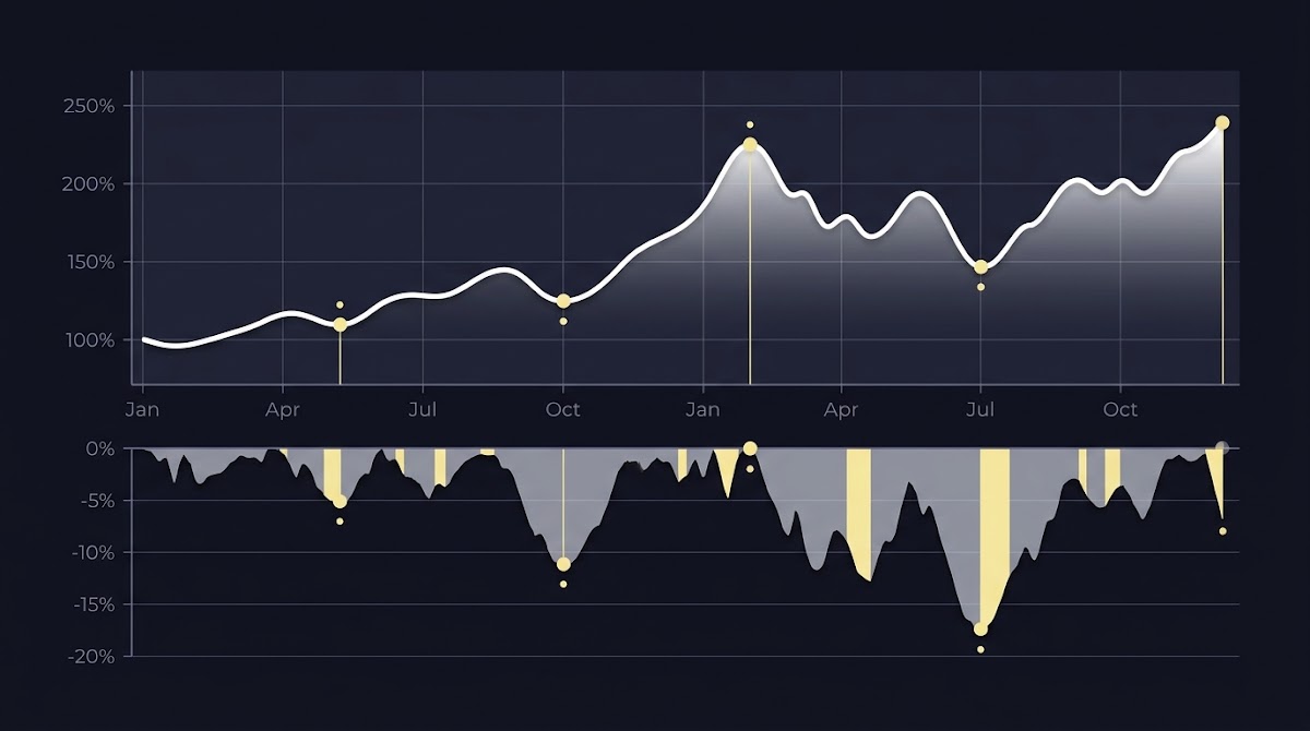
Why drawdown charts matter for risk analysis
Using Drawdown Charts to Understand Risk starts with the simple idea that where returns come from matters as much as how large they are. A drawdown is a peak to trough loss and a plotted underwater series shows the percent decline from the last peak over time, which exposes persistence and clustering in losses that average returns can hide, and that is why reading charts is essential for risk-aware evaluation Portfolio Visualizer underwater chart and A look at drawdowns
Use standardized frequency and lookback to compute MDD plot the underwater series to inspect clustering and recovery measure duration to trough and time to breakeven then translate observations into conditional controls that combine depth and duration and validate rules with back tests.
Financial summaries like mean return or volatility give one number but they do not show the path a strategy took to get there. A single worst decline, reported as maximum drawdown, is useful, but it compresses a sequence of events into one statistic; the charted series makes the sequence visible so you can see repeated shallow drops, long slow recoveries or one abrupt tail event Investopedia MDD article
For practitioners assessing sports prediction strategies or evaluation challenges, charts reveal whether losses were clustered around a short period of bad results or spread across many events. That matters for policy design because persistence suggests behavioral or regime problems that simple summary metrics miss. The visual record helps decide whether a strategy needs conditional controls, longer evaluation windows or both Portfolio Visualizer underwater chart

How to read the four elements on a drawdown chart
Start reading a chart by locating the peak, which is the 0 percent reference. That peak is the highest cumulative value reached before the drop begins, and it anchors every subsequent drawdown measure in the series; identify that line first and note its date before moving to depth and timing Drawdown definition overview
Next identify the trough and the maximum depth experienced from that peak. The largest observed peak to trough decline in the chosen lookback window is the maximum drawdown, and it is the single worst loss that the history shows over the period you are examining Investopedia MDD article
Explore FundedPlays challenge rules for structured evaluations
Try reading a sample underwater chart and note the peak date, the trough depth and the dates of the moves in between.
Measure duration from the date of the peak to the date of the trough. Duration tells you how quickly losses accumulated and can be as important as the depth when evaluating operational limits. After the trough, measure recovery time from trough back to the prior peak; this time to breakeven helps you understand how long capital was at risk before full recovery Portfolio Visualizer underwater chart
When you walk through these four elements in order peak, trough, duration and recovery you get a structured read that highlights severity and persistence separately. Practically, that makes it easier to turn what you see into rules such as conditional pauses or review triggers rather than relying on a single summary number Drawdown definition overview
Maximum drawdown (MDD): calculation and measurement choices
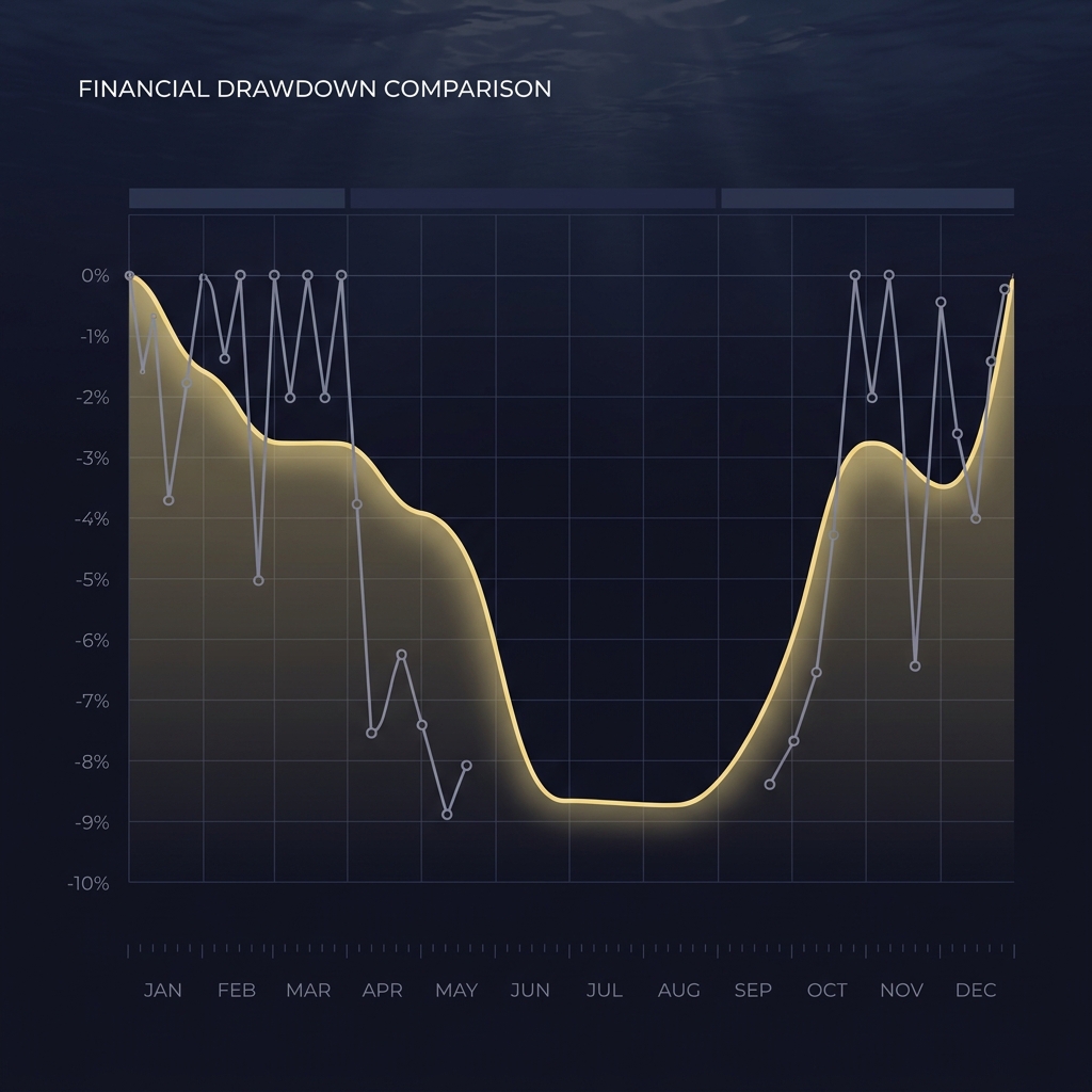
Maximum drawdown is the largest peak to trough percentage decline observed over a specified period, and computing it means scanning the series for each peak then measuring the drop to the lowest subsequent trough within your lookback window Investopedia MDD article
How you sample returns matters. Higher frequency data and longer lookback windows tend to record larger maximum drawdowns because more observations and longer history allow rare adverse sequences to appear. That path and window dependence is why standardizing measurement frequency and lookback period is essential when you compare two strategies Drawdown measure in portfolio optimization
In practice, report MDD together with the measurement frequency such as daily weekly or monthly sampling and the exact lookback window you used. Stating these two choices makes comparisons reproducible and reduces the risk of drawing misleading conclusions from incompatible statistics Portfolio Visualizer underwater chart
Reading an underwater chart: what the full series reveals
An underwater chart plots the running percentage drop from the most recent peak so it reveals every instance a strategy moved away from a prior high and how long it stayed below that level. This continuous series highlights clustering where many small drawdowns occur close together and extended under water runs where recovery is slow Portfolio Visualizer underwater chart
Visual patterns matter. Long flat troughs suggest slow recovery and a sustained period of capital being below peak. Repeated shallow dips show high turnover or frequent small losses that may indicate churn. Sudden deep drops point to tail events where an abrupt loss dominated the path. Two strategies with the same maximum drawdown can therefore have very different operational implications depending on the underwater shape Portfolio Visualizer underwater chart

For analysts designing evaluation challenges, the underwater series is particularly useful because it shows whether a failing sequence was isolated or persistent across events. That visibility helps set meaningful checkpoints and makes it easier to interpret whether a poor stretch is recoverable within a contest window Guide to the Markets drawdowns and recoveries How Funded Plays evaluations work
Putting drawdown metrics into decision rules
Translating measurements into rules is how teams operationalize risk tolerance. A common control is a hard maximum drawdown stop loss that triggers review or removal from an evaluation if the observed peak to trough loss exceeds a predefined band. Such hard limits convert a subjective comfort level into an enforceable checkpoint Drawdown measure in portfolio optimization
Another approach is step down or staged de risking where exposure is reduced in bands as drawdown deepens. This staged approach balances the chance for recovery against the need to limit further losses and can be calibrated to strategy characteristics rather than using a single universal cutoff Investopedia MDD article
Monitoring rule checklist for drawdown triggers
Use for consistent reporting
Pairing depth limits with duration conditions is often practical. For example a temporary dip beyond a band that recovers within a short duration may warrant no action while a similar depth that persists past a duration threshold may trigger staged de risking. That conditional logic helps avoid knee jerk reactions to transient moves Drawdown measure in portfolio optimization
Metrics that complement drawdown charts
The Calmar ratio frames performance as return divided by maximum drawdown and provides an intuition for reward per unit of worst observed downside path risk. A higher Calmar ratio indicates more return earned per unit of the worst drawdown over the measurement period and is a compact complement to chart inspection Investopedia Calmar ratio
Duration based summaries like average time to recovery or median time to breakeven add context about persistence. Two strategies with the same MDD could have very different median recovery times which changes how you think about operational limits and expectations for re qualification after setbacks Portfolio Visualizer underwater chart

For comparative evaluation use at least one ratio such as the Calmar ratio and one duration metric along with the underwater chart before forming a judgment. The combination provides depth clarity timing and a reward to drawdown perspective that is more robust than any single statistic Investopedia Calmar ratio
Common mistakes and pitfalls in drawdown interpretation
A frequent error is ignoring measurement frequency and lookback when comparing MDDs. Comparing a daily sampled eleven year history to a monthly sampled three year window will almost always mislead because path dependent statistics scale with sampling and window length Drawdown measure in portfolio optimization Drawdown Analysis
Another pitfall is overweighting a single historical worst drawdown as if it were an immutable ceiling on future risk. Historical extremes are informative but they are conditioned on past regimes and do not by themselves set future limits without additional scenario tests Portfolio Visualizer underwater chart
Also avoid mixing series with heterogeneous definitions such as differences in rebalancing timing sampling or return calculation. These technical inconsistencies can produce misleading MDD differences that have nothing to do with the strategy's underlying risk behavior Drawdown measure in portfolio optimization
Practical examples and scenarios to practice on
Consider a strategy with shallow frequent drawdowns that quickly recover. The underwater chart for such a strategy will show short dips that bounce back frequently indicating churn rather than a single large event. Monitoring implications could include tighter churn controls but less need for long time to recover rules Portfolio Visualizer underwater chart
Contrast that with a scenario where a rare deep drawdown occurs with a long recovery. Historical market guides document that large equity drawdowns can take multiple years to recover and that reality underscores why duration matters as much as depth for evaluation policies Guide to the Markets drawdowns and recoveries Macro Opportunities-An Analysis of Drawdowns
When designing evaluation windows choose checkpoints that include intermediate duration checks rather than a single end point. For example require periodic reviews during a contest window to see whether adverse moves are transient or persistent and adjust rules based on those observations rather than a single post mortem Portfolio Visualizer underwater chart
Create a standard reporting checklist that always lists the measurement frequency the lookback window the observed MDD the duration to trough and time to recovery together with an accompanying underwater chart. This checklist supports reproducibility and clear communication with stakeholders Investopedia MDD article
How to monitor and report drawdown results consistently
Annotate charts with event markers and exact dates for peaks and troughs to make reviews concrete. Including these annotations makes it easier to connect drawdown phases to external events or to particular decision points in a strategy's lifecycle Portfolio Visualizer underwater chart
When communicating results be explicit about the limits of historical drawdowns and remind readers that past path does not guarantee future behavior. Transparency about these boundaries prevents overconfidence and aligns expectations with the conditional nature of historical evidence Drawdown measure in portfolio optimization
Summary: combining charts, metrics and rules for practical risk limits
Combining an underwater chart maximum drawdown and duration metrics gives a practical three part view of downside path risk. Charts show the shape metrics quantify depth and duration and rules translate observed behavior into enforceable checkpoints that can be back tested for the chosen challenge or strategy Portfolio Visualizer underwater chart Funded Plays blog
Next steps for readers include picking a standard measurement frequency choosing an explicit lookback running underwater charts and then setting conditional controls rather than adopting fixed universal cutoffs. Back test your rules on historical sequences to confirm they behave as intended before applying them to active evaluation challenges Drawdown measure in portfolio optimization Funded Plays
Maximum drawdown is the largest peak to trough percentage decline over a chosen window; reporting the sampling frequency and lookback makes comparisons reproducible and avoids misleading differences caused by sampling choices.
An underwater chart shows the sequence of declines and recoveries so you can see persistence clustering and recovery duration that a single MDD value cannot convey.
Conditional rules that combine depth and duration are generally preferable because they allow for transient dips while protecting against persistent losses.
References
- https://www.portfoliovisualizer.com/underwater-chart
- https://www.coffee-can-investor.com/p/a-look-at-drawdowns
- https://www.investopedia.com/terms/m/maximum-drawdown-mdd.asp
- https://en.wikipedia.org/wiki/Drawdown_(economics)
- https://www.investopedia.com/terms/m/maximum-drawdown-mdd.asp
- https://doi.org/10.1142/S0219024905002762
- https://www.portfoliovisualizer.com/underwater-chart
- https://www.portfoliovisualizer.com/underwater-chart
- https://www.investopedia.com/terms/c/calmarratio.asp
- https://am.jpmorgan.com/us/en/asset-management/adv/insights/guide-to-the-markets/
- https://www.fundedplays.com/challenges
- https://www.fundedplays.com/blogs/how-fundedplays-evaluations-work
- https://www.fundedplays.com
- https://www.fundedplays.com/blogs
- https://www.westernasset.com/us/en/pdfs/whitepapers/macro-opportunities-an-analysis-of-drawdowns.pdf
- https://support.lonsec.com.au/hc/en-us/articles/205154945-Drawdown-Analysis