
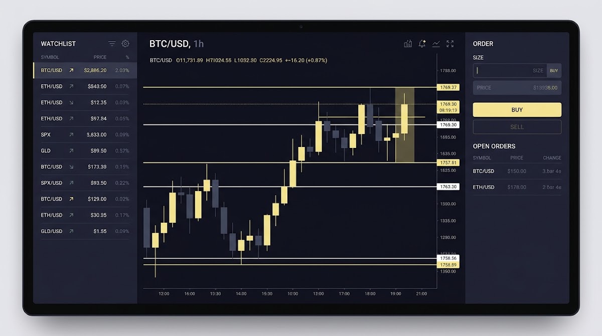
Dashboard overview: main panels and layout
Start by building a quick mental map of the dashboard so you can move confidently between tasks. The top-level areas to expect are a navigation bar that groups major sections, an account summary that shows balances or challenge status, a main workspace that houses charts and the order panel, side panels for watchlists and notifications, and a footer with help and links. This layout supports the typical flows used during evaluation challenges and lets you reach key controls quickly.
Good dashboards keep information concise and organized to reduce cognitive load and let you scan for what matters, such as active orders or critical alerts. Following service design guidance for data dashboards helps you focus on the most relevant items and see short trends at a glance, supporting quick decisions during timed sessions GOV.UK service manual. Vendor guidance such as Tableau's accessibility guidance can be helpful.
Prepare your workspace with a guided tour and saved layout
Consider starting a guided tour or loading a saved layout before a timed session to reduce setup time and avoid avoidable clicks.
When you first open the workspace, locate the navigation bar at the top, a compact account summary near it, the main charts in the center, and watchlists or activity on the sides. Exact labels and positions can change with product updates, so check official platform notes on the Funded Plays blog when something moves.
Accessibility first: keyboard, contrast, and predictable controls
Accessible dashboards reduce friction for all users and make tasks faster to complete. Key principles to watch for are perceivable content, operable controls, understandable information, and robustness across assistive technologies. These are core ideas in the current accessibility standard and help you set expectations for a reliable interface WCAG 2.2. See the WAI overview WCAG overview.

Quick checks you can run now include verifying keyboard navigation for main controls like the watchlist, order panel, and chart zoom; checking that color contrast on labels, chart lines, and badges is sufficient; and confirming visible focus states when tabbing through controls. If any of these are missing, note specifics before you report an issue to support so they can reproduce the problem.
Accessibility benefits everyone, not only those using assistive tools. Clear focus states and proper contrast make it easier to scan a crowded dashboard, and predictable control behavior reduces mistakes during a challenge session. If you encounter barriers, describe the exact control, where it appears, and how it behaves when raising a ticket.
Using the watchlist: set up, filters, and quick actions
Create a watchlist to group the selections you plan to follow during an evaluation. A well organized watchlist lets you track multiple items side by side, sort by value or time, and jump from a list entry into a chart or order panel without extra navigation. Start by adding items you expect to monitor, then save that list as a session preset for repeatability Investopedia watchlist.
Locate the navigation bar, account summary, main workspace, side panels, and footer; use watchlists and charts to monitor selections, submit limit orders from the order panel with confirmations, and track drawdown and progress indicators to manage risk.
After you create a watchlist, use filters and tags to keep the view tidy. Common actions include sorting by upcoming event time, tagging selections by confidence level, and enabling alerts for items that cross a threshold. Alerts and tagging let you narrow attention during busy periods and reduce the chance of missing a priority item.
For a typical evaluation session, organize a watchlist into a small working set of 6 to 12 items you intend to monitor closely. Keep secondary items in a separate list so they do not clutter the main view. Save the working set as a layout to restore it quickly before a timed session.
Charts and visualizations: reading candlestick and trend views
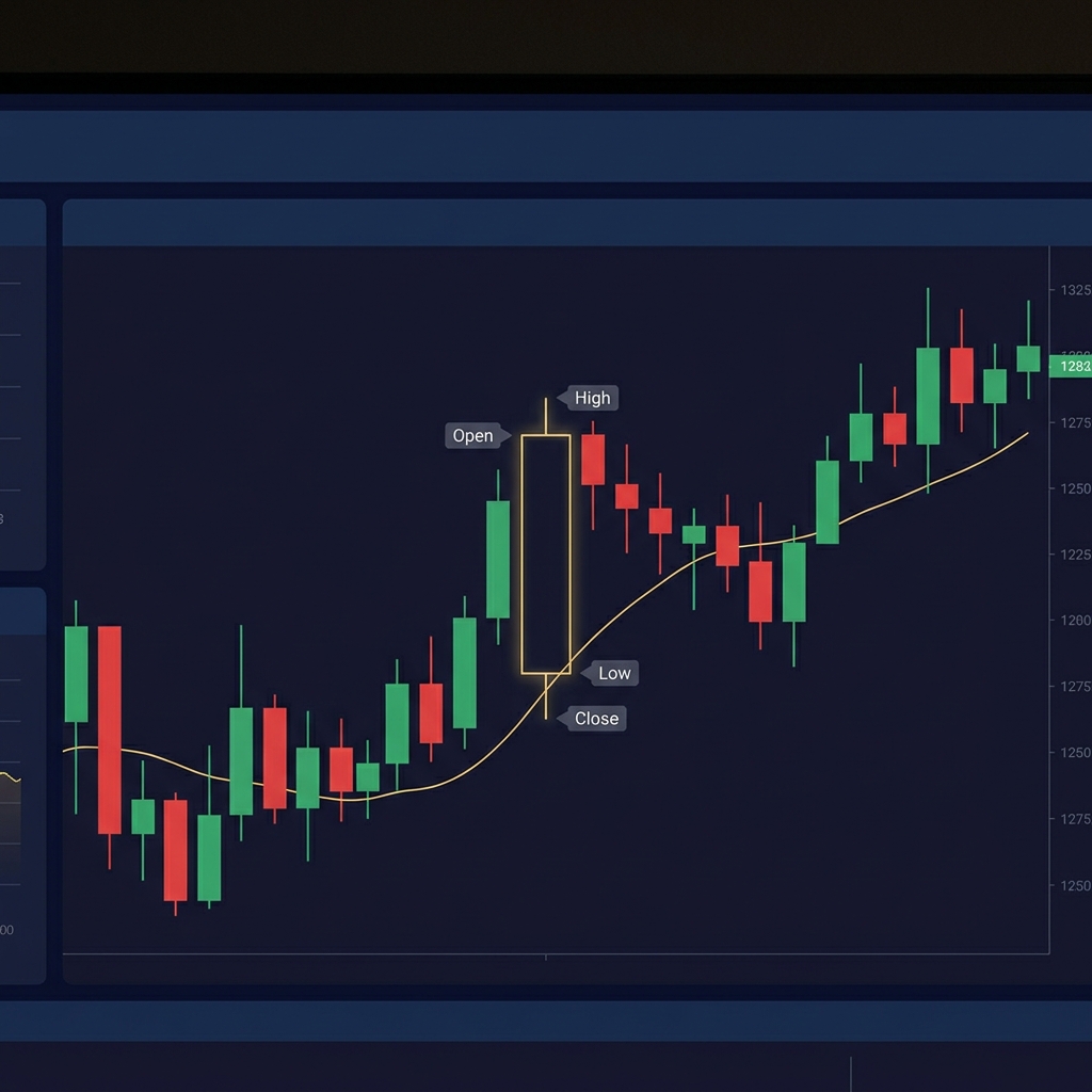
Charts are central to quick decision making. Use a glance for trend direction and a deeper view for entry or exit timing. A candlestick chart shows open, high, low, and close values within a chosen timeframe and helps you judge volatility and momentum before placing an order Investopedia candlestick.
Read the main candlestick elements this way: the body shows the open and close range, and the wick shows the extreme values within the period. Larger bodies and long wicks typically indicate stronger intraperiod movement or volatility. Pick timeframes that match your evaluation pace: shorter frames for immediate decisions, longer frames to identify persistent trends.
Use overlays and multiple timeframes sparingly during timed challenges. Simple moving averages or trendlines can filter noise, but avoid overloading the chart with indicators. Practice switching timeframes and using a small set of overlays so you can interpret signals quickly when the clock matters.
Order panel essentials: order types, confirmations, and placements
The order panel is the control center for submitting actions. It is usually adjacent to or integrated with your main chart and shows fields for selection, side, size, and order type. Familiarize yourself with where it lives so you can open it and verify fields before submitting.
A common order type to understand is the limit order. A limit order instructs the system to execute at a specified price or better, giving you control over the execution conditions and reducing surprise fills in fast moving situations. Knowing how limit orders behave guides how the panel should present choices and confirmations Investopedia limit order.

Typical safeguards in the order panel include a confirmation step, editable fields before final submission, and an explicit cancel option. After sending an order, verify it in the order history and watch for status updates. These steps help avoid accidental submissions during a timed challenge.
Risk and performance metrics: drawdown, win rate, and tracking
Drawdown is a core risk measure you will see on evaluation dashboards. It records the peak-to-trough decline of an account or selection and indicates how far performance fell from a prior high. Monitoring drawdown is essential to understand if you are approaching challenge thresholds that may affect qualification Investopedia drawdown.
Other useful metrics include win rate, streaks, and realized versus unrealized outcomes. Win rate gives a sense of decision accuracy over a sample, while streaks highlight runs of wins or losses that can influence short term strategy. Compare realized and unrealized results to understand what is settled versus what is still at risk.
Use metrics to decide when to reduce activity or pause. If drawdown approaches a predefined limit, consider tightening position sizes or stepping back to avoid breaching evaluation rules. Remember that metrics describe past performance and do not guarantee future outcomes.
Account progression: funded challenges, goals, and indicators
Progress indicators show where you stand in a challenge and how much remains to reach a milestone. Common signals include progress bars that fill as you meet objectives, badges for completed steps, and milestone notifications when you unlock a new stage. These indicators help you pace activity and focus on goals.
When you see a progress bar, use it to understand how close you are to qualification and to prioritize the tasks that will move the bar. Progress bars are concise visual summaries useful for quick checks during sessions before reviewing detailed metrics.
Quick account progression checks to follow during a session
Use before placing new orders
Keep in mind that exact qualification rules and milestone mechanics are set by the platform and can change. Always review the official challenge documentation on Funded Plays for precise criteria and required behaviors.
Alerts, notifications, and quick actions
Notifications can include price alerts, milestone alerts, and system messages about session status. Expect options to enable or mute these types so you can prioritize what interrupts your workflow and what you receive passively.
Set high priority alerts for the items that will require immediate response, such as threshold breaches or milestone completions, and mute lower priority noise during focused evaluation periods. This helps you keep attention on the most consequential events without becoming distracted.
Quick actions are shortcuts that reduce clicks, for example one-step submissions or instant cancels if available. Use them cautiously and ensure confirmations are enabled for high impact actions to avoid accidental commands during fast sessions.
Customization: saved layouts, themes, and saved filters
Saved layouts let you restore a preferred workspace in seconds. Create a compact layout for live evaluation sessions with only the charts, order panel, and a small watchlist visible. Store a separate review layout for post-session analysis with expanded metrics and history.
Theme or contrast options help both comfort and accessibility. Choose a high contrast or dark theme if it improves readability for you, and save that preference as part of a layout when possible. These settings reduce eye strain and make key elements stand out during long sessions.

Export or share views when you need feedback or coaching. Exporting a view as an image or CSV of key metrics can help when reviewing performance with a coach or for your own records, and keeps the session workflow reproducible.
Common tasks checklist: preparing for an evaluation session
Pre-session, verify your account balance or virtual bankroll, load a saved layout, confirm active alerts, and test connectivity. A short checklist reduces setup errors and ensures your workspace is ready before the timed part of a challenge begins.
During a session, keep an eye on drawdown, monitor the watchlist for changes, and review any open orders. Pause before placing new orders if metrics signal elevated risk or if multiple events coincide in the same timeframe.
After the session, export results, record lessons learned, and compare your realized metrics against goals. Small notes on what worked and what did not turn into a focused practice plan for the next session.
Troubleshooting and common mistakes to avoid
Frequent errors include misreading chart timeframes, accidentally submitting orders with incorrect sizes or prices, and ignoring drawdown limits until they become urgent. Catching these early prevents avoidable losses and helps keep you within challenge rules.
When the UI seems out of sync, try a refresh, reapply saved filters, and check your order history to confirm state. If problems persist, gather screenshots, timestamps, and the steps to reproduce the issue before contacting support so the team can act on precise information.
Collecting clear logs and a concise description reduces back and forth with support. Note which controls you interacted with and the expected result versus what occurred to speed up resolution.
Session timeouts are common in evaluation environments to protect accounts and maintain system stability. Expect a timeout policy and avoid leaving critical actions partially completed to reduce the risk of unintended submissions when a session ends.
Export your session results in available formats for offline review. Typical exports include CSV or simple report snapshots that help you track progress over time without relying solely on the platform view.
Protect account access with strong, unique passwords and never share credentials. If you notice suspicious session activity, report it immediately and review recent session logs if available.
Practical scenarios: step-by-step walkthroughs
Scenario 1, setting up a watchlist and placing a limit order: add a small set of items to a new watchlist, open a candlestick chart for your target selection, choose an appropriate timeframe, then open the order panel and submit a limit order with a clear confirmation step. Verify the order in history after placement.
Scenario 2, monitoring drawdown and adjusting activity: watch your drawdown metric during an early losing run. If drawdown approaches a threshold, reduce position sizes, pause new entries, and focus on higher confidence setups until the account regains ground.
Scenario 3, reviewing session results and saving a layout: export the session metrics, save a snapshot chart for a representative trade, and store the layout you used so you can return to the same workspace next session for consistent practice.
Wrap up and next steps: resources and what to practice
Practice the core actions that make dashboards effective: building a focused watchlist, reading candlestick charts, placing and verifying limit orders, and monitoring drawdown. Repetition makes these tasks faster and reduces error rates during timed challenges.
For further reading, consult accessibility standards and dashboard design guidance to deepen your understanding of usable interfaces and to inform feedback you might send to the platform WCAG 2.2 GOV.UK service manual Power BI accessibility.
Before your next challenge, load a saved layout, run through the pre-session checklist, and review the practice scenarios above so you start with a repeatable, low friction routine. See our blog for more tips.
Test keyboard navigation, visible focus states, and sufficient color contrast; report issues with exact controls and steps to reproduce.
A limit order sets the price at which execution may occur, ensuring trades only fill at the specified price or better.
Watch the peak-to-trough decline indicator, compare it to your risk threshold, and reduce activity if drawdown approaches limits.
References
- https://www.gov.uk/service-manual/design/designing-data-dashboards
- https://help.tableau.com/current/pro/desktop/en-us/accessibility_dashboards.htm
- https://www.w3.org/TR/WCAG22/
- https://www.w3.org/WAI/standards-guidelines/wcag/
- https://www.investopedia.com/terms/w/watchlist.asp
- https://www.investopedia.com/terms/c/candlestick.asp
- https://www.investopedia.com/terms/l/limitorder.asp
- https://www.fundedplays.com/challenges
- https://www.investopedia.com/terms/d/drawdown.asp
- https://learn.microsoft.com/en-us/power-bi/create-reports/desktop-accessibility-overview
- https://www.fundedplays.com/blogs/how-fundedplays-evaluations-work
- https://www.fundedplays.com
- https://www.fundedplays.com/blogs