

What it means to combine numbers with context and why it matters
How to Combine Quantitative Data with Context is a practical task: it means treating numeric results and contextual evidence as parts of a single, coherent argument rather than two parallel outputs. In practice this requires asking which questions the numbers can answer, which contextual insights fill interpretive gaps, and where the two sources agree or conflict.
A concise definition is useful: integrating numeric results with contextual information means linking quantitative estimates, their uncertainty, and data provenance to qualitative evidence about mechanisms, constraints, and stakeholder perspectives so that conclusions are interpretable and decision relevant.
Official guidance on producing quality analysis emphasizes this joined approach to evidence and recommends documenting how different strands were evaluated and combined, so readers can judge fitness for purpose and transparency; see The Aqua Book for guidance on analysis quality and documentation The Aqua Book.
Why does integration improve decision relevance? Numbers alone often omit critical context about where and when an effect is likely, who is affected, and which operational constraints apply. When analysts explicitly link quantitative estimates to contextual information, decision makers can see whether a statistical effect is meaningful in practice and what caveats apply.
Short scenarios show how integration changes interpretation. Scenario A: a point estimate shows a 3 percent improvement from an intervention, but qualitative reports reveal implementation gaps that make that improvement unlikely at scale. Scenario B: a small, statistically uncertain effect is supported by multiple independent qualitative reports of consistent behavior change; together the mixed evidence strengthens the case for cautious piloting.

These examples underline why mixed methods and evidence integration matter for analysts who need to move from numbers to action (see how Funded Plays evaluations work).
Definitions: quantitative, qualitative, and contextual evidence
Quantitative evidence refers to numeric data and statistical summaries drawn from designed studies, administrative sources, or observational datasets. Qualitative and contextual evidence covers process descriptions, stakeholder interviews, field notes, and operational constraints that explain how and why observed patterns might occur.
In many practical settings you will find that the two forms answer complementary questions: quantitative analysis estimates size and uncertainty, while contextual evidence explains mechanisms, plausibility, and implementation barriers. Treating them together avoids false certainty and improves the relevance of recommendations.
When integration changes the conclusion: short examples
Consider a cost estimate that hinges on a single administrative dataset. If that dataset contains measurement error or missing records concentrated in certain groups, the headline estimate may misrepresent equity impacts. A short integration exercise that documents data provenance and cross checks with qualitative reports prevents misleading summaries.
Another short example concerns external validity. Numeric results from one region may not generalize; local qualitative reports that highlight differing practices or supply constraints can change both the interpretation and the recommended decision path.
Step 1: Assess data quality and fitness for purpose before you integrate
Start every integration with a focused fitness-for-purpose assessment. This prevents downstream mistakes where weak or biased inputs are treated as definitive. A clear checklist keeps teams consistent and defensible.
Checklist, stepwise:
- Define the decision question precisely and list the key variables needed to answer it.
- Assess provenance: who collected the data, for what purpose, and under which protocols.
- Check completeness: identify missingness patterns and whether missingness is random or systematic.
- Evaluate measurement error: understand instruments, coding rules, and potential misclassification.
- Screen for bias: sampling bias, selection effects, and known confounders.
- Decide fitness: document whether the data are sufficient, partial, or unsuitable for integration.
Documenting fitness-for-purpose is not optional. The Aqua Book recommends recording these choices so qualitative evidence can be interpreted correctly alongside numeric results The Aqua Book.
Diagnostics and practical tests follow the checklist. Run simple missingness checks, compare distributions to known benchmarks, and inspect metadata for changes in definitions over time. These diagnostics help flag problems like nonrandom missingness or structural breaks that demand caution.
Practical tests to run immediately include examining the pattern of missing values by subgroup, plotting distributions against external benchmarks for plausibility, and reviewing data collection notes for known changes in measurement. If a diagnostic finds concerning patterns, consider reweighting, imputation with caution, or restricting analysis to more reliable subsets.
Make integration auditable and decision ready
Before you link numbers and narrative, pause to document whether your quantitative inputs are fit for the decision at hand and note any limits that should appear in the final report.
Finally, capture and version your fitness decisions. A brief metadata note that records the checks you ran and the rationale for inclusion or exclusion of data makes integration auditable and reduces later disputes about interpretation.
Checklist for data quality: bias, completeness, measurement error, and provenance
Use the earlier numbered steps as a reproducible checklist. Explicitly state suspected biases and likely directions of error so readers can judge whether qualitative corroboration changes your confidence.
A short template entry might read: provenance: administrative claims, collected for billing, likely underreporting in rural clinics; missingness: 12 percent overall, concentrated among older patients; measurement error: instrument changed in 2019. This captures the core concerns succinctly.
Practical tests: missingness patterns, plausibility checks, and metadata review
Run group-level missingness cross tabs, visualize time trends for suspicious breaks, and compare means to external sources where available. These quick tests often reveal whether data are usable or whether further cleaning or alternative sources are needed.
When you use these diagnostics, summarize the results in a short appendix or machine readable metadata file so qualitative reviewers and stakeholders can inspect your assumptions.
Step 2: Explicit integration techniques for linking numbers and narrative
Joint displays and when to use them
Joint displays are structured tables or figures that place quantitative columns next to qualitative summaries and confidence statements so readers can see alignment and conflict at a glance. They are especially useful when multiple evidence streams address the same outcome or when comparing subgroups.
A joint display pairs numeric estimates and uncertainty measures with brief contextual notes, data quality flags, and a short judgement about coherence. When crafted well, it reduces the need for readers to flip between annexes and the main text.
Mixed methods guidance provides concrete templates and recommends joint displays as a primary integration tool for systematic reviews and mixed evidence syntheses; see Cochrane Handbook chapter on qualitative evidence and the Atlasti guide for templates and use cases.
By assessing data fitness, using explicit mixed methods integration techniques, communicating uncertainty with calibrated language and visuals, and testing assumptions with scenario and sensitivity analysis so that conclusions are transparent and actionable.
Weaving and triangulation: narrative patterns that clarify agreement and conflict
Weaving means integrating qualitative and quantitative findings within the same narrative so that each paragraph addresses a single analytic claim and presents both numeric evidence and contextual explanation. Triangulation compares patterns across methods to judge robustness.
Choose weaving for audiences who need an interpretive flow, such as program managers. Use triangulation when you want an explicit statement about agreement or disagreement across methods, for example stating that qualitative reports corroborate a quantitative trend or that they contradict it and why.
Guidance on mixed methods recommends making the integration strategy explicit in methods sections so readers can follow how you combined evidence and to allow replication of the synthesis approach JBI manual.
Practical template for a joint display
Annotated joint display template, compact form:
- Row label: Outcome or subgroup.
- Column 1: Quantitative estimate and uncertainty.
- Column 2: Data quality flags and provenance notes.
- Column 3: Key qualitative findings or stakeholder quotes.
- Column 4: Integrative judgement: coherence, confidence, and recommended action.
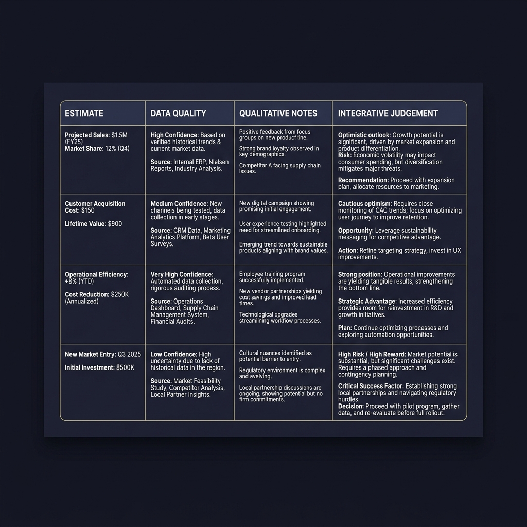
Short example of weaving a narrative with one result: "Estimate: 0.15 increase, 95 percent interval [0.02, 0.28]. Context: implementers report low adherence due to supply shortages. Integration: effect likely under current conditions; recommend targeted supply improvements before scaling." This pairs the numeric estimate with provenance, qualitative mechanism, and a decision-relevant recommendation.
Step 3: Communicate uncertainty clearly and avoid false precision
Single point estimates often overstate certainty. Best practice is to use calibrated language, intervals or probabilities, and visuals that show distributional uncertainty so readers can see the range of plausible outcomes and the implications for decisions.
Official guidance emphasizes calibrated language and explicit confidence qualifiers to avoid misleading precision; for guidance on calibrated uncertainty language consult the IPCC synthesis report for examples of clear, standardized phrasing IPCC AR6 synthesis.
Calibrated language and confidence statements
Prefer phrases like "likely", "medium confidence", or probabilistic ranges tied to intervals instead of bare point estimates. Always pair an action implication with the confidence level; for example, "We estimate a probable range of outcomes and recommend piloting under controlled conditions given medium confidence in the estimate."
Document how confidence labels were assigned, whether by statistical criteria, corroborating qualitative evidence, or both. This transparency helps stakeholders interpret recommendations correctly and reduces the risk of overcommitment.
Visual approaches: intervals, fan charts, and quantile displays
Visuals should make uncertainty intuitive; see the uncertainty visualization pipeline (MIT uncertainty visualization).
The UK Government Analysis Function provides practical guidance and examples for visualising uncertainty that are useful for analysts preparing decision briefs and stakeholder materials Visualising uncertainty guidance.
When choosing a visual, consider the audience: use intervals and simple error bars for nontechnical stakeholders, while distributional plots suit technical reviewers who will inspect tails and shape.
A minimal plotting and documentation checklist for uncertainty visuals
Include caption explaining implications
Include clear captions that explain what the uncertainty means for decisions (see discussion of qualitative expressions of uncertainty here). For example: "Shaded band shows the central 80 percent range; outcomes in the tails are possible but less likely; plan for contingencies if outcomes approach the upper band." Captions reduce misinterpretation and anchor visual intuition to decisions.
Step 4: Use scenario and sensitivity analysis to test contextual assumptions
Scenarios and sensitivity checks reveal how conclusions change when key contextual assumptions vary. They are essential when inputs or contextual factors are uncertain or when decisions depend on plausible alternative futures.
Scenario design starts with identifying the most uncertain contextual parameters that affect outcomes, such as participation rates, implementation fidelity, or external shocks. Define plausible ranges for each and construct a small set of internally consistent scenarios to explore.
Official guidance recommends scenario and sensitivity analysis to stress test conclusions and to show decision makers when a recommendation is robust across plausible alternatives; see the Aqua Book for practical advice on documenting scenario assumptions The Aqua Book.
Designing plausible scenarios
Choose scenarios that reflect real operational decisions: best reasonable case, central case, and constrained case are often sufficient. Ensure scenarios are grounded in qualitative evidence about system behavior so they are credible to stakeholders.
Document scenario assumptions clearly and tie them to evidence sources. For example: "Constrained case assumes 50 percent adherence based on implementer interviews in region X, central case assumes 70 percent adherence based on pilot reports." This links the numeric sensitivity exercise to contextual inputs in a transparent way.
Running and presenting sensitivity checks
Run one-way and multi-way sensitivity analyses for key parameters, and present results in compact tables or tornado plots that show which assumptions drive the largest changes in conclusions. Accompany plots with short interpretive notes that explain whether and how decisions would change.
If conclusions flip across plausible scenarios, do not hide that fact. Instead report the sensitivity clearly and recommend contingency rules or further data collection to reduce critical uncertainty.
Decision criteria: when integrated evidence is strong enough to act
Integrated evidence rarely yields binary answers. A pragmatic decision checklist helps translate degrees of confidence into recommended actions such as pilot, scale cautiously, or investigate further.
Decision checklist, core items:
- Relevance: Does the combined evidence address the decision question directly?
- Coherence: Do quantitative and qualitative strands point in the same direction?
- Robustness: Are results stable across plausible scenarios and sensitivity checks?
- Acceptable uncertainty: Can stakeholders tolerate the remaining uncertainty for the proposed action?
These criteria are practical and intended to be applied qualitatively. For example, if relevance and coherence are high but robustness is low, the recommended action might be a constrained pilot that gathers targeted data to reduce the most important uncertainty.
Translating degrees of confidence into actions means setting explicit thresholds in your reporting. A conservative threshold could require coherence and robustness for full scale; a permissive threshold might accept a consistent qualitative corroboration plus modest quantitative evidence to justify a small expansion.
Common pitfalls and how to avoid them
Several recurrent mistakes undermine integration. Overinterpreting point estimates, ignoring bias in inputs, combining incompatible datasets without adjustments, and cherry picking qualitative quotes to fit a preferred story are common problems.
Mitigations are straightforward: preregister integration plans where feasible, keep a transparent audit trail of decisions, present conflicting evidence openly, and subject the integrated report to peer review or an independent quality check.
Another frequent error is hiding uncertainty in appendices rather than foregrounding it. Integrate uncertainty statements into main conclusions so decisions are made with a clear sense of remaining risks rather than after-the-fact caveats.
When a mistake is discovered, explain the error, re-run the minimal analyses needed to check whether conclusions change, and update the report with corrected integration and revised recommendations. This recoverable approach supports trust and learning.
Practical examples, templates and short reproducible workflows
Joint display template with annotated fields
Compact joint display template for reporting:
- Outcome / subgroup
- Quantitative estimate, interval
- Data quality notes
- Key qualitative finding
- Integrative judgement and recommended next step
Annotate each cell with a one line source citation and a one sentence implication for action. This makes the display readable and actionable for stakeholders who need a quick, evidence-based recommendation.
Two short scenarios: policy and program evaluation
Policy scenario: A regional health program shows a modest average improvement in outcomes backed by a plausible mechanism from implementer interviews. Use a joint display to present the estimate, note data limitations, show interview highlights that support the mechanism, run a sensitivity analysis on adherence, and recommend a staged scale with monitoring.
Program evaluation scenario: An educational intervention yields uncertain average effects but consistent positive qualitative reports from teachers about classroom process changes. Use weaving in the report to present the quantitative uncertainty alongside teacher narratives, and recommend targeted replication with pragmatic fidelity checks before a wider rollout.
Software suggestions: standard statistical packages can produce intervals and fan charts; simple plotting libraries can overlay uncertainty bands and quantile plots. For joint displays, a spreadsheet or a lightweight reporting template in a document or notebook is often sufficient and easier for stakeholders to inspect than complex dashboards. See our blog for related posts.

How to report integrated results: conclusions, limitations and next steps
Reporting integrated results should pair each key conclusion with explicit limitations, a calibrated confidence statement, and a short list of recommended next steps. This provides decision makers with the information they need to act responsibly.
Template paragraph to copy and adapt: "Conclusion: [one line summary of integrative judgement]. Confidence: [low/medium/high] with rationale referencing data quality and corroboration. Limitations: [brief list of major caveats]. Recommended next steps: [specific actions such as targeted data collection, pilot, or implementation adjustments]." Use this template consistently across findings so stakeholders can compare claims easily.
Highlight unresolved uncertainties and propose concrete follow up, such as a small rapid study to reduce a single key source of uncertainty, or a monitoring indicator to track whether real world outcomes align with modelled scenarios. Clear next steps make reports useful rather than only descriptive.
Quick checklist and further resources
One page checklist to use before reporting:
- Have you documented data provenance and fitness for purpose?
- Did you pair each numeric result with contextual notes or qualitative evidence?
- Are uncertainty visuals included and clearly captioned?
- Have you run scenario and sensitivity checks for key assumptions?
- Does each conclusion include limitations, confidence, and next steps?
Authoritative resources for deeper study include The Aqua Book for analysis quality, the IPCC AR6 synthesis for calibrated uncertainty language, and mixed methods manuals such as the Cochrane and JBI guidance for integration techniques, and Funded Plays for related materials.
Responsible claims note: avoid promising guaranteed outcomes. State what is known, what remains uncertain, and what steps stakeholders can take to reduce critical uncertainties.

Start by assessing data quality and fitness for purpose, checking provenance, missingness, measurement error, and likely biases before combining evidence.
Use calibrated language, intervals or probabilities, and visuals such as intervals or fan charts; pair each estimate with a clear implication for decisions.
When evidence is relevant, coherent across methods, robust in sensitivity checks, and the remaining uncertainty is acceptable to stakeholders for the proposed action.
References
- https://www.gov.uk/government/publications/the-aqua-book-guidance-on-producing-quality-analysis-for-government
- https://training.cochrane.org/handbook/current/chapter-21
- https://atlasti.com/guides/the-guide-to-mixed-methods-research/how-to-integrate-quantitative-qualitative-data
- https://www.fundedplays.com/challenges
- https://www.fundedplays.com/blogs/how-fundedplays-evaluations-work
- https://www.fundedplays.com/blogs
- https://www.fundedplays.com
- https://jbi-global-wiki.refined.site/space/MANUAL/4687344/Chapter+8%3A+Mixed+methods+systematic+reviews
- https://www.ipcc.ch/report/ar6/syr/downloads/report/IPCC_AR6_SYR_SPM.pdf
- https://analysisfunction.civilservice.gov.uk/policy-store/visualising-uncertainty/
- https://vis.csail.mit.edu/classes/6.859/lectures/13-Uncertainty.pdf
- https://pmc.ncbi.nlm.nih.gov/articles/PMC7868089/